What this guide helps you do
Use Mosaic with the sections and controls this theme currently supports. This reference lists visible controls so you can find the right guide and avoid looking for a section this design does not provide.
Before you start
Own the store or have Edit design access. Select this theme only within its store category. Keep original content available before changing themes, and use Partner for catalog/operations.
Where to find it
Workspace → Experiences → store → Visual Editor. On phones open the editor controls from its menu/rail, then the named panel. Use the preview size controls to inspect computer and phone layouts.
Step by step
-
Open Theme and select Mosaic from the themes offered for this category.
-
Check Brand & colors; selecting a theme can fill its starting colors. Choose any intended changes.
-
Open each listed editor panel. Customer capabilities describe storefront features and do not create a separate editor panel. Change one field at a time and inspect its preview.
-
For item names, stock, prices, collections or options, follow the management link to Partner and use the appropriate catalog guide.
-
For phone-only editor navigation, open the panel menu rather than searching for the computer side rail. Scroll within long panels to reach their controls.
-
Choose Save changes after reviewing the preview. Saving is manual; publishing and checkout eligibility are separate.
-
Reopen the public store and check the layout, links, checkout and order page on both a phone and a computer.
Understand the choices
-
Theme — Choose the layout; changing it can change which sections appear.
-
Brand & colors — Set the name, branding and supported header information. Check both phone and computer previews.
-
Store name (Brand & colors): Required. Enter the displayed wording.
-
Primary color (Brand & colors): Optional. Choose the brand color and check text contrast.
-
Accent color (Brand & colors): Optional. Choose the brand color and check text contrast.
-
Modes offered / Default mode (Brand & colors): Choose Light, Dark or both; choose the default when both are offered. Both adds a visitor toggle.
-
Logo image (Brand & colors): Optional. Upload a supported file or Paste URL, position the logo in the fixed 1:1 crop and choose Use crop before Save changes. Allowed: PNG, JPEG, WEBP.
-
Logo icon (Brand & colors): Optional. Choose a displayed icon/preset.
-
Cover rotation interval (seconds) (Brand & colors): Optional. Enter a valid number. Minimum 3. Maximum 10.
-
Cover design (Brand & colors): Optional. Choose a displayed icon/preset.
-
Shipping / dispatch time (Brand & colors): Optional. Enter the displayed wording.
-
Delivery badge (Brand & colors): Optional. Enter the displayed wording.
-
Tagline (Brand & colors): Optional. Enter the displayed wording.
-
Products & catalog — Catalog content is managed in Partner. The visual editor provides a read-only view and a management link.
-
Pricing — The visual editor shows a read-only currency/pricing preview for current stores. Use Manage in Krobr Partner for product prices, charges, promotions and delivery fees.
-
Buttons — Change visible button wording without promising an unavailable action.
-
Place-order button text (Buttons): Required. Enter the displayed wording.
-
Add-to-cart button text (Buttons): Optional. Enter the displayed wording.
-
Primary button label (Buttons): Optional. Enter the displayed wording.
-
Secondary button label (Buttons): Optional. Enter the displayed wording.
-
Button label (CTA section) (Buttons): Optional. Enter the displayed wording.
-
Fulfillment — Configure actual checkout methods in Partner; presentation fields do not activate an unavailable method.
-
Submission page — Customize the customer order-page presentation. Status and payment rules remain operational settings.
-
Re-order (Submission page): Optional. Turn on to show/enable it; turn off to hide/disable it.
-
Request change / cancel (Submission page): Optional. Turn on to show/enable it; turn off to hide/disable it.
-
Contact business (Submission page): Optional. Turn on to show/enable it; turn off to hide/disable it.
-
Leave a review (Submission page): Optional. Turn on to show/enable it; turn off to hide/disable it.
-
Opening hours — Showing hours is presentation. Actual opening times, all-Closed days and timezone are controlled in Partner.
-
Map / Location — Enter the correct location/address and test the displayed map or directions link.
-
Embed code (paste from Google Maps) (Map / Location): Optional. Enter readable text and check line breaks.
-
Heading (optional) (Map / Location): Optional. Enter the displayed wording. Maximum 60.
-
Address (optional) (Map / Location): Optional. Enter the displayed wording. Maximum 200.
-
Navigation — Check that each visible navigation link points to a section you have enabled.
-
Show cart button (Navigation): Optional. Turn on to show/enable it; turn off to hide/disable it.
-
Link: shop (Navigation): Optional. Turn on to show/enable it; turn off to hide/disable it.
-
Link: about (Navigation): Optional. Turn on to show/enable it; turn off to hide/disable it.
-
Link: lookbook (Navigation): Optional. Turn on to show/enable it; turn off to hide/disable it.
-
Link: store info (Navigation): Optional. Turn on to show/enable it; turn off to hide/disable it.
-
Hero — Introduce the store with its main headline, supporting text and allowed cover controls.
-
Show this section (Hero): Optional. Turn on to show/enable it; turn off to hide/disable it.
-
Eyebrow (Hero): Optional. Enter the displayed wording.
-
Headline (Hero): Optional. Enter the displayed wording.
-
Subheadline (Hero): Optional. Enter readable text and check line breaks.
-
Show rating (Hero): Optional. Turn on to show/enable it; turn off to hide/disable it.
-
Primary button label (Hero): Optional. Enter the displayed wording.
-
Show secondary button (Hero): Optional. Turn on to show/enable it; turn off to hide/disable it.
-
Secondary button label (Hero): Optional. Enter the displayed wording.
-
Hero image (Hero): Optional. Select a supported photo and confirm its crop before Save changes. Allowed: PNG, JPEG, WEBP.
-
Story — Explain the business in clear text and check long paragraphs on a phone.
-
Show this section (Story): Optional. Turn on to show/enable it; turn off to hide/disable it.
-
Eyebrow (Story): Optional. Enter the displayed wording.
-
Title (Story): Optional. Enter the displayed wording.
-
Body (Story): Optional. Enter readable text and check line breaks.
-
Story image (Story): Optional. Select a supported photo and confirm its crop before Save changes. Allowed: PNG, JPEG, WEBP.
-
Product grid — Browse the actual items and categories. Edit products/menu data through Partner rather than rewriting the display here.
-
Show product images (Product grid): Optional. Turn on to show/enable it; turn off to hide/disable it.
-
Show prices (Product grid): Optional. Turn on to show/enable it; turn off to hide/disable it.
-
Featured — Choose supported featured presentation and ensure the referenced catalog items are still available.
-
Show this section (Featured): Optional. Turn on to show/enable it; turn off to hide/disable it.
-
Lookbook — Add relevant photos, review their order and check cropped phone previews.
-
Show this section (Lookbook): Optional. Turn on to show/enable it; turn off to hide/disable it.
-
Store info — Show the store information customers need before visiting; match the operational hours and contact details.
-
Show this section (Store info): Optional. Turn on to show/enable it; turn off to hide/disable it.
-
Address (Store info): Optional. Enter the displayed wording.
-
Hours (Store info): Optional. Enter the displayed wording.
-
Phone (Store info): Optional. Enter the displayed wording.
-
Google Maps link (Store info): Optional. Enter the displayed wording.
-
Show map button (Store info): Optional. Turn on to show/enable it; turn off to hide/disable it.
-
Show address (Store info): Optional. Turn on to show/enable it; turn off to hide/disable it.
-
Show hours (Store info): Optional. Turn on to show/enable it; turn off to hide/disable it.
-
Show phone (Store info): Optional. Turn on to show/enable it; turn off to hide/disable it.
-
Contact form — Show accurate contact details or contact form text. Sending a message does not place an order.
-
Show this section (Contact form): Optional. Turn on to show/enable it; turn off to hide/disable it.
-
Eyebrow (Contact form): Optional. Enter the displayed wording.
-
Title (Contact form): Optional. Enter the displayed wording.
-
Body (Contact form): Optional. Enter readable text and check line breaks.
-
Collect: name (Contact form): Optional. Turn on to show/enable it; turn off to hide/disable it.
-
Collect: email (Contact form): Optional. Turn on to show/enable it; turn off to hide/disable it.
-
Collect: phone (Contact form): Optional. Turn on to show/enable it; turn off to hide/disable it.
-
Reviews — Choose supported review presentation. Real customer reviews are managed in Partner.
-
Show this section (Reviews): Optional. Turn on to show/enable it; turn off to hide/disable it.
-
Show average + count (Reviews): Optional. Turn on to show/enable it; turn off to hide/disable it.
-
Show individual reviews (Reviews): Optional. Turn on to show/enable it; turn off to hide/disable it.
-
Call to action — Give customers a clear next action and test its supported destination.
-
Show this section (Call to action): Optional. Turn on to show/enable it; turn off to hide/disable it.
-
Title (Call to action): Optional. Enter the displayed wording.
-
Body (Call to action): Optional. Enter readable text and check line breaks.
-
Button label (Call to action): Optional. Enter the displayed wording.
-
Footer — Review footer wording and contact/social links; avoid broken or misleading destinations.
-
Customer accounts — This customer capability is available where its prerequisites and store settings allow it. Follow the related task guide.
-
Variant selection — This customer capability is available where its prerequisites and store settings allow it. Follow the related task guide.
-
Guest cart — This customer capability is available where its prerequisites and store settings allow it. Follow the related task guide.
-
Multi-step checkout — This customer capability is available where its prerequisites and store settings allow it. Follow the related task guide.
-
Discount codes — This customer capability is available where its prerequisites and store settings allow it. Follow the related task guide.
-
Customer ratings — This customer capability is available where its prerequisites and store settings allow it. Follow the related task guide.
-
Order confirmation & tracking — This customer capability is available where its prerequisites and store settings allow it. Follow the related task guide.
-
Product search & filters — This customer capability is available where its prerequisites and store settings allow it. Follow the related task guide.
-
Saved items & recently viewed — This customer capability is available where its prerequisites and store settings allow it. Follow the related task guide.
-
Visitor light/dark toggle — This customer capability is available where its prerequisites and store settings allow it. Follow the related task guide.
Check the result
The saved Mosaic storefront shows the supported sections and your intended presentation. A section absent from this reference is not offered by this theme; choose another supported design if you need it.
If something goes wrong
-
Panel missing: verify the selected theme/category and this control list. Not every theme supports every section.
-
Catalog field read-only: open Partner. Hiding a section does not delete its items or close the store.
-
Preview differs after theme change: review the new theme colors, supported sections and phone layout before saving.
-
Changes disappeared: choose Save changes and wait for Saved for success before leaving the editor; check permissions and any validation message.
Screenshots
These screenshots use demonstration data. Your names, amounts and available controls may differ. Current values on your own screen take priority.
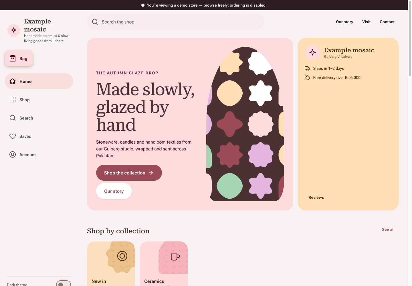
Mosaic theme: controls and differences: inspect this theme’s layout and navigation in the example storefront.